Hydrogrid ↓


CD Project
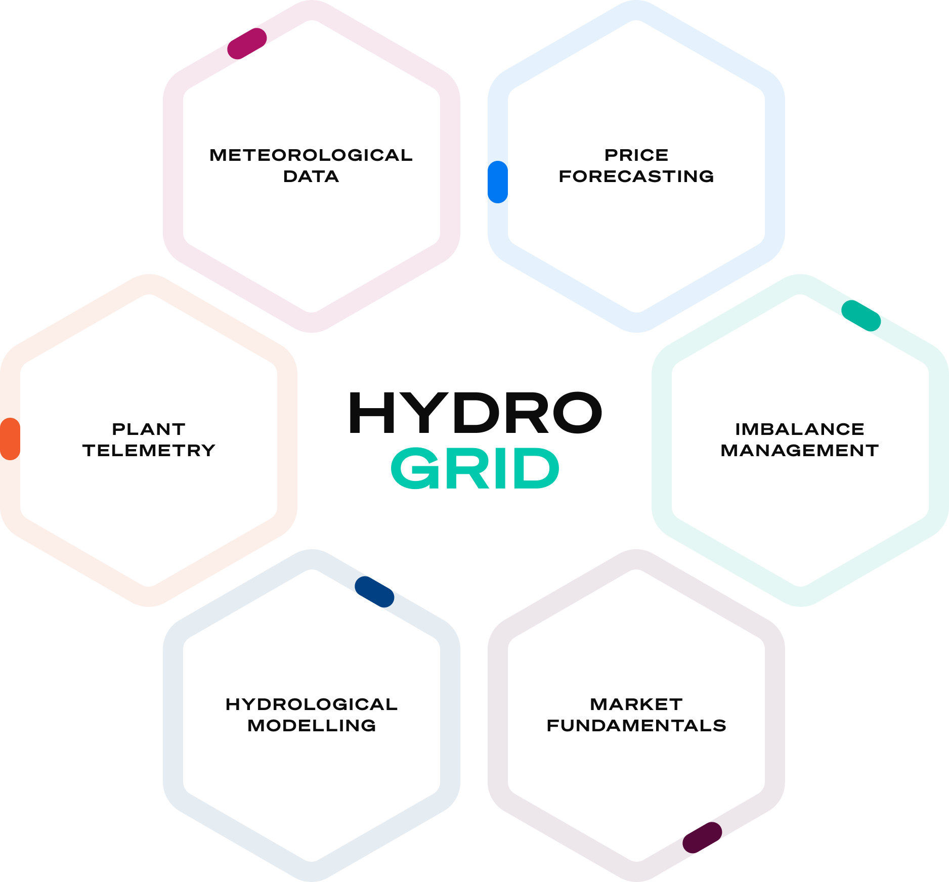
A corporate design was created to establish a cohesive visual identity for Hydrogrid. This included logo development, a refined colour system and supporting key visuals to strengthen its positioning in the renewable energy sector. The concept conveys a modern and trustworthy aesthetic, tailored to reflect the company’s focus on innovative digital solutions that optimise hydropower operations and promote sustainable energy use.
ROLE
Corporate Design
Brand Direction
COMPANY
JKLDesign
CREATION
2016
Branding ↓