Dan Tsantilis – Photographer
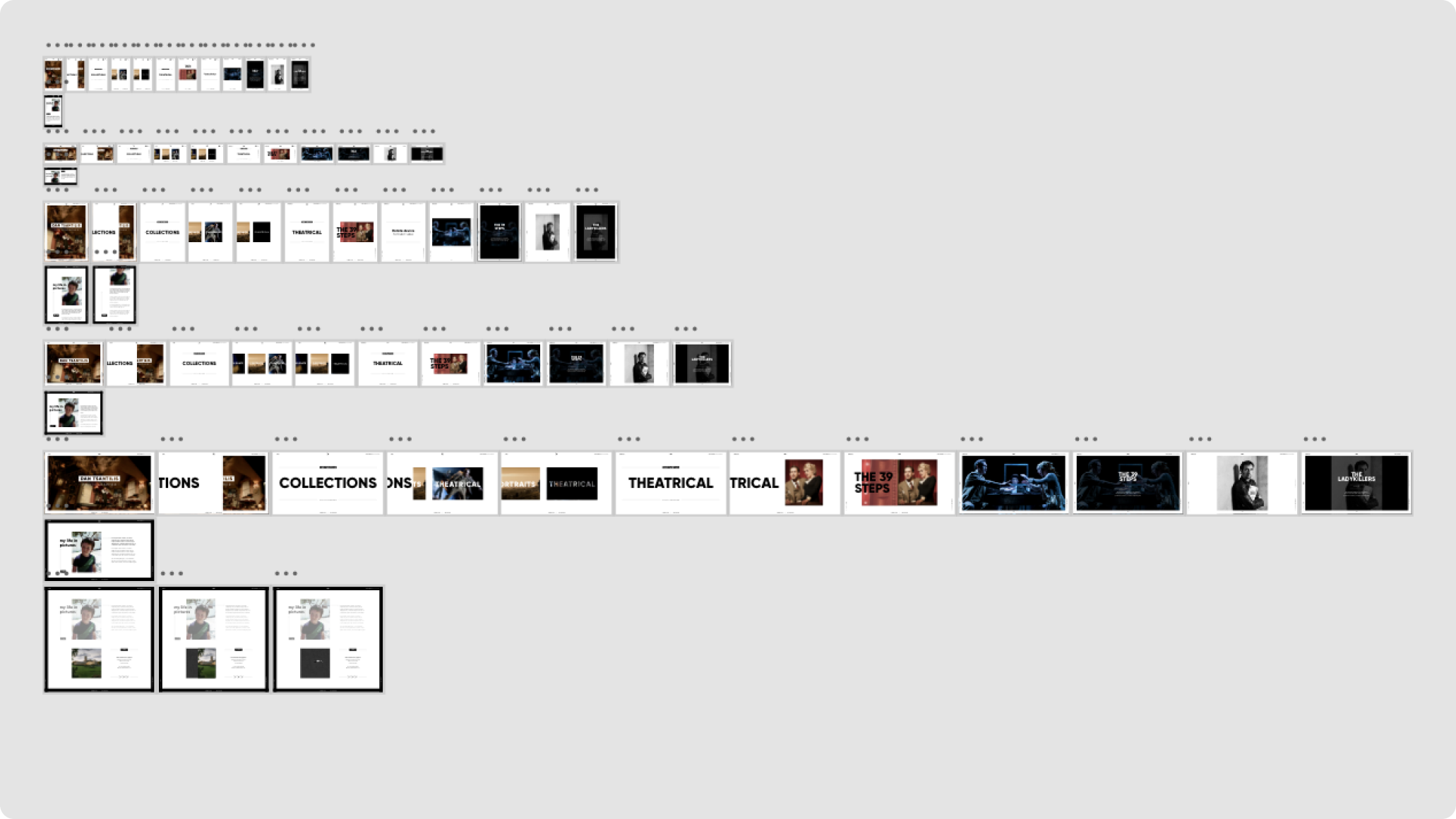
Taking full advantage of the latest technology this website utilises the large screen experience and introduces animation and dynamic features such as a scrollable main menu.
ROLE
Concepting UX
UI design
Screen design
Responsive
Design system
Art direction
COMPANY
JKLdesign
CREATION
2016
LINK
Offline
CHALLENGE
The client needed a timeless portfolio website to showcase a diverse body of photographic work, combining maximum visual impact with intuitive navigation. The aim was to place imagery at the centre of the storytelling.
ROLE
I designed the UX and UI, developed responsive layouts for different aspect ratios, and built a clean typographic system to compliment the photography. My focus was on framing imagery clearly and ensuring seamless navigation across devices.
IMPACT
The site delivers a strong digital presence, showcasing work with maximum impact and minimal interface elements. It serves as a platform that attracts industry attention and enables effortless ongoing updates.

100%
Responsive optimised
for all devices
+40%
Increase in portfolio enquiries after launch
2x
Faster browsing
speeds

 SCROLL→